The art of the seasonal gallery wall
I adore hanging art on my walls and I feel so lucky that throughout my life I’ve accumulated some lovely pieces. The only problem is space.
I couldn’t possibly have enough room to display all the photos, paintings, and prints that I’ve collected over the years. My solution? The seasonal gallery wall. It’s basically a layout of chunky, matted frames with artwork that switches out based on the season or holiday. I know I’m not the first person to think of this, but I am disappointed it’s not a more popular design approach. So I figured I’d, y’know, blog about it so that people can see how absolutely simple and affordable it is. Let’s dive in, shall we?
Hang those dang frames up, bebe
Let’s start with the first hurdle in your gallery wall journey. I have so many friends and family members who are scared to physically hang frames on their wall. Their reasons vary, but some central themes are worry about damaging the walls, fear of not placing them correctly, or belief that all frames require some elaborate mounting mechanism. So let me be your bright ray of encouragement here: the majority of frames are simple to hang.
Most interior walls are some form of wood, plaster or drywall. (Sorry, masonry-wall kiddos with exposed brick or cement block, you’re going to need an advanced course with a drill involved.) Those surfaces are designed to take a nail, and those tiny nail holes can be patched up very simply with spackle or wood fill in the future. Don’t be intimidated by the act of hammering a nail into a wall. It’s 2020 and there are so many more interesting things to be intimidated by, like rolling your own sushi or mastering a Rubik’s cube. Frames are not scary. If you have art you wish was on your walls, please hang it. Like, right after you’re done reading this. Go do it.
As far as placement goes, I learned a trick a few years ago that has served me well. A friend of mine mentioned she uses brown paper cut in the size of her frames and tapes it on the wall to get a sense of layout before she actually hangs anything. Before this trick, I was a “you can always nail another to adjust” person, but this really does save you a lot of work. The process is simple: use old brown packing paper or flattened grocery bags, lay them out flat, then trace the frame and cut out the shape. After the frame is traced, use a ruler against the back of your frame to measure where the hanging mechanism is. Use that to mark the placement of the hanger on your brown paper. Voila! You can tape up the collection of brown paper frame templates and rearrange until you have something you love. (Blue painter’s tape is amazing for this because it removes and repositions like a dream.) When you’re ready, nail right through the brown paper where you’ve marked the hangers and then hang the corresponding frame in its new position. Oh, and a quick note on the age-old “how do I know how high to hang it?” question. Eye level. When in doubt, walk up to your wall and find where your eyeballs hit. Mark that with a pencil. Then find the center of the frame (or the middle of the group of frames if you’re doing a gallery wall) and put that center point where your eyeballs are. Eye level is always a safe bet. After all, you want to actually look at your art, right?
Finally, most frames today are designed to be lightweight. My favorite collection is Ribba and Sannahed from IKEA. They look like thick gallery frames, but their construction and plexiglass make them lighter than their real-glass counterparts. A single nail or screw will be plenty to hold up most budget-friendly frames today – anything you’re picking up at a big box retailer or craft store. If it’s real glass, if it’s a super heavy decorative frame, or if it strains your wrist to hold it out in one hand, consider reinforcements like frame hooks to distribute the weight more evenly in your wall.
Assemble a gallery wall shell
I have a two gallery walls sprinkled around our studio apartment: a little group of three frames in the bathroom and a long gallery wall in our main area. The trick to building a gallery wall framework is hanging groups of frames in different sizes that fit the space. I’ll admit that when I updated the wall this summer, I got carried away with the number of frames and it got too busy. I took everything down and started with a new layout. There’s no magical calculation for how many frames is right, but I share this story because I want you to know it’s also okay to adjust as you go.
I’m a big believer in the “gallery” aesthetic of gallery walls, so I love simple white frames and big white mat borders that let the art inside really shine. But that is by no means a requirement. You could do frames of any color or style. The recommendation I’d make is ensure they have mats and that they’re the same general color scheme. The empty space from mats gives the gallery wall a little room to breathe and keeps the group of frames from looking too clustered. And having one cohesive color makes them seem like a thoughtful grouping. Break these rules if you’d like, they’re just a starting place for your own exploration!
As for the layout itself, look to your magical guide: the interwebs. The simplest way to start is by researching what others have done in terms of groupings and sizes. Be inspired. Another way is to pick anchor pieces you know you need to incorporate -- like an 8x10 portrait frame for that one photo you love -- then build your layout around those frames you know you have to have.
My little sister just bought a stunning house in Nashville and I’ve tricked her into joining me on my seasonal gallery wall quest. Because I’m already working on layout examples for her, here are five different ways you can lay out a gallery wall of 7 frames.
These layouts are just me fiddling around with rectangles until I have something that feels interesting and balanced. You’ll notice I always try to keep the same distance between frames, like a grid. This is a personal preference, but I like how organized it makes the compositions look. The walls above are done with two 8x10s, two 12x16s, one 16x20 and one 9x9. (All of these are at IKEA, meaning you could do this for about $40.) And the combinations you can make with just these 7 frames are endless. So start thinking about how many frames you’d like in your gallery, and then start playing with shapes. It’s not precious. Have fun with it.
That’s the shell! Your group of frames that will always be in that position on your walls. The real fun comes from swapping out the art inside them into mini curated collections. It constantly refreshes your space and helps you make room to celebrate all the art pieces in your life.
Swap out whenever you please
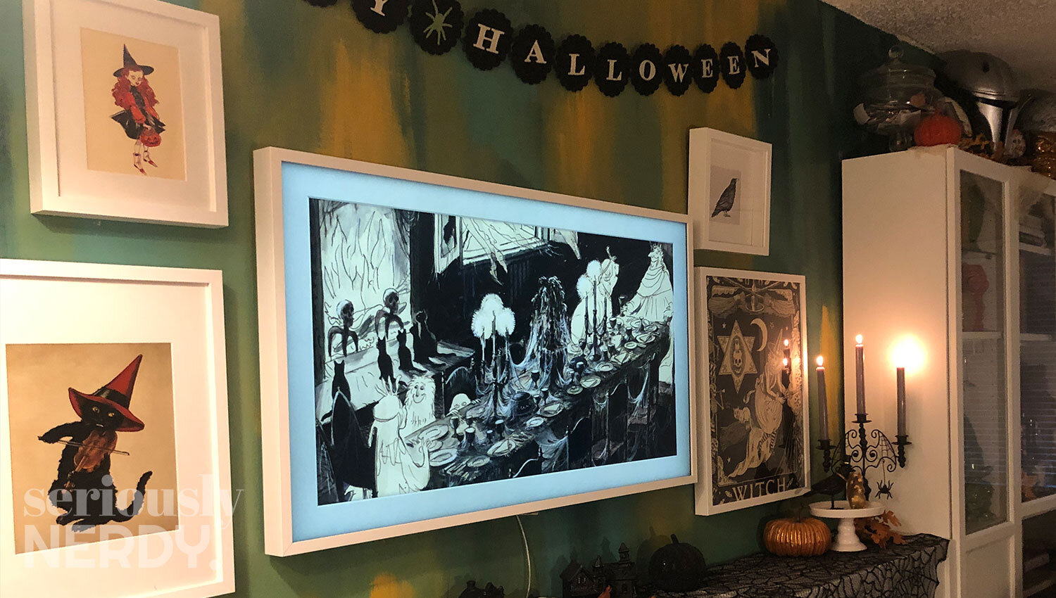
You want to change it annually? Awesome. Seasonally? Go for it. There are no rules. But the basic idea I use is that, in a small studio apartment, art is a great way to celebrate holidays when space is at a premium. I don’t have the room for a full Christmas village or a creepy Halloween faux mantlepiece. But I do have five frames I can change out to match the seasons, and with a couple accent pieces, it seems to do the trick.
Aside from the seasons or holidays, interchangeable gallery walls are a great way to rotate in your kiddos’ artwork, copies of your latest Instagram photos, or charming prints you can’t seem to stop buying on Etsy. They’re a place to showcase what’s important to you now. It might be a trend that you want to play with temporarily, or a concept you want to try but aren’t sure you want to commit to.
Perhaps my most favorite thing about seasonal gallery walls is how affordable they make designing an interior space. Take that $40 work of IKEA frames, and you can fill them with art that fits your budget. Online photo companies can produce lovely matte prints for under $1, and you can find some adorable art prints online for under $20 each AND support a small business to boot. Collecting art is also the perfect souvenir.
I hope my shenanigans have inspired you to create your own curated art collection a chance. Gallery walls are such a simple, affordable way to take the things you love and bring them to life cohesively. After all, what better way to live your life than surrounded by memories and images that inspire you.


