Every little thing I learned painting my first dozen miniatures
I can only hope you’re primed and ready for an excessive rundown of my step-by-step journey through the minis I have since painted, and some things I learned along the way.
I already gave you my rundown of the basics that helped me jump into miniature painting in my previous post about painting, so I wanted to focus on the lessons and pitfalls I’ve stumbled upon as I hone my addictive new hobby.
Kits don’t quits
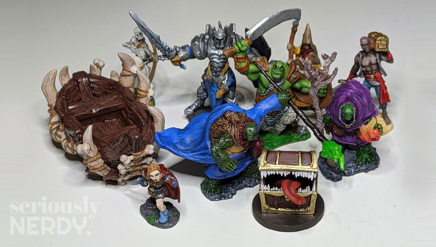
I still swear by the Reaper Bones Core Skills kit and Layer Up! kit. I was glad to cut my teeth on some cheap units that I wasn’t passionate about before I ruined something that cost me actual dollars. Each kit came with 3 units to paint, each made of very cheap plastic. How cheap? Well, my skeleton’s bow, knight’s sword, and wizard’s staff all arrived bent. So, that cheap. None of them came with traditionally-sized bases, and they feel slightly smaller than your standard unit. So yeah, cheap. But just right for making some dope mistakes!
The Core Skills set comes with a skeleton, ogre, and knight. The instructions tell you water-to-color combinations to use to base coat, shade, and drybrush each. I’ll say that I spent a few hours on each mini, because I had no idea what I was doing and because I’m generally a slow painter. Before starting, they recommend rinsing the unit and scrubbing it with a toothbrush to remove any nonsense from the factory, etc.
Base coating is the process of applying a base color to the unit. Pretty straightforward. This is the general color I want the thing to be, just in a solid even coat across the area. For the Skellington, it’s a sandy color for the body and a light brown for the bow. You get the gist.
Shading is the process of bringing out the shadows in an area. This is key for giving your unit depth. If you’re using a shade, it may darken the whole surface, but should still pool in any cracks. If you don’t have a shade, you can use a darkened variation of the base coat watered down to be thinner. This will prevent your coat from washing out the base coat completely.
Drybrushing is the process of gently applying a highlight to the raised areas of your unit. You can achieve the light touch by wiping most of the paint off your brush so you just get a light coat. I usually test this on the back of my thumb because it makes me feel like a cool guy who knows what he’s doing. If the paint is going on thick, I wipe more off the brush. I find it handy to have a junky feathered brush for drybrushing, because the process seems to wreak havoc on the bristles. You want to focus on raised areas and points closer to your “light source.” I generally imagine my light source being in front of and slightly above my unit, since I’m mostly looking at them from the front. If you happen to be painting something that contains a light source (characters holding a lantern, etc.), then keep in mind that you will need to paint in response to that light source to make it look natural.
The above concepts were my key takeaways from the Core Skills set. I essentially do these 3 steps with every unit I paint. I managed to both underdo it and overdo it on the shading and drybrushing at different moments. I even went back and touched up with my base coat color a couple times. You can also just clean and wet your brush and seriously dilute layers, but you may end up leaving resistant blotches of that layer that you’re trying to erase. Try not to worry, mistakes will happen.
I don’t have any standalone pictures of the second kit, Layer Up!, but you can see the chick in the front left, and a wizard and pirate in the back right. These three were essentially more of the same, though there was a lot of emphasis on fabric.
My major takeaways from this kit were that I don’t know how to paint a six-pack, and FABRIC IS HARD. You have to blend the shades along the folds in the fabric to give it a wave, but blending is awful.
Painting 3D prints
My next 3 picks all happened to be 3D-printed. The first 2, a Mimic Chest and the Bone Boat, were purchased from a vendor at DesignerCon. They’re pretty high-quality prints for the scale, but they still had flaws typical for 3D printing versus your professionally manufactured, molded plastic. I had to clean up the mimic with an X-Acto knife to give clean surfaces, and it still wasn’t perfect.
The Mimic presented some interesting lessons. First, I learned how crucial it is to paint areas in a certain order. For example, I had to paint all of the inside of the Mimic’s mouth first, since I knew I’d be hitting the teeth and tongue by mistake. Then I painted the tongue, then the wooden surfaces, then the gold edging and the finally the teeth. In most cases, I prefer to base coat, shade, and drybrush a section at a time. This ensures that I’m confining any mistakes to the area I’m currently working on. I do love the way he came out. His teeth are a little white; I’ve since gotten better bone paints. You’ll notice some interesting print defects on this piece, like threads on the teeth and the strange failed design near the lock. All in all, it wasn’t that noticeable.
The Bone Boat was fun, as it was the largest and simplest piece I had painted. I did learn that if you’re mixing a color, you want to make sure you mix enough of it for all the painting that you’re doing. It’s a nightmare trying to recreate a color blend because you just barely didn’t have enough paint. I also learned that painting ropes binding bones together suuuuuucks. There were essentially no print flaws in this one, so I’ll save that all for the Beholder.
I printed the Beholder myself on my FlashForge Adventurer. The print lines are very apparent, and the fine details just couldn’t deliver. In fact, the painting actually drew intense focus to the horizontal print lines. It was a little heartbreaking. I also learned some hard lessons about supports, as I had to reprint a couple of the eye stalks due to support failures. Still, at a distance, he looks pretty good. He has terrifyingly lush lips, bloodshot eyeballs, and some irritated gumlines. Dani helped me get the pupils to look a little more realistic. This one was easily the most flying-by-the-seat-of-my-pants. I worked from images of other beholders I found on a Google image search to come up with a color scheme. I base coated him in a deep purple, then used a more bluish purple to drybrush the outer spikes. I think he’s a handsome boy, but maybe beauty is in the eyes of the Beholder? No. I’m sorry.
The Skellington Crew
Now that I had cut my teeth on a good handful of dudebros, I jumped full-on into my first big ambition, which was a Games Workshop set of Deathrattle Skeleton Warriors. I found them on Amazon, and they were very charming with their bone banners and the one guy with his big doot-doot trumpet. It turns out Warhammer does more of a “some assembly required” vibe, so Dani helped me snap them out and glue them together. It even came with some leftover arms and legs, which I’ll eventually come up with a use for.
After seeing how my first Skellington and my Bone Boat went, I had resolved to buy better bone paints. So I sampled Citadel’s Morghast Bone and Vallejo’s Bonewhite. I based everything in Morghast Bone and used Bonewhite for highlights and Citadel Reikland Fleshshade for the shadows. I did one or two to completion first, then realized I was being ridiculous and started painting all of the bone sections on all of them at once, then all of the armor, all of the fabric, and all of the details. For the sake of simplicity, I painted torsos, then we glued arms on. It was much easier to navigate.
Stretching for color themes
I don’t know about you, but sometimes I struggle to come up with a good color scheme. Then it dawned on me: why do I have to be original? I can be derivative and amuse myself to no end! That cracked up a lot of options and brings us to the Tortles and Frightbag.
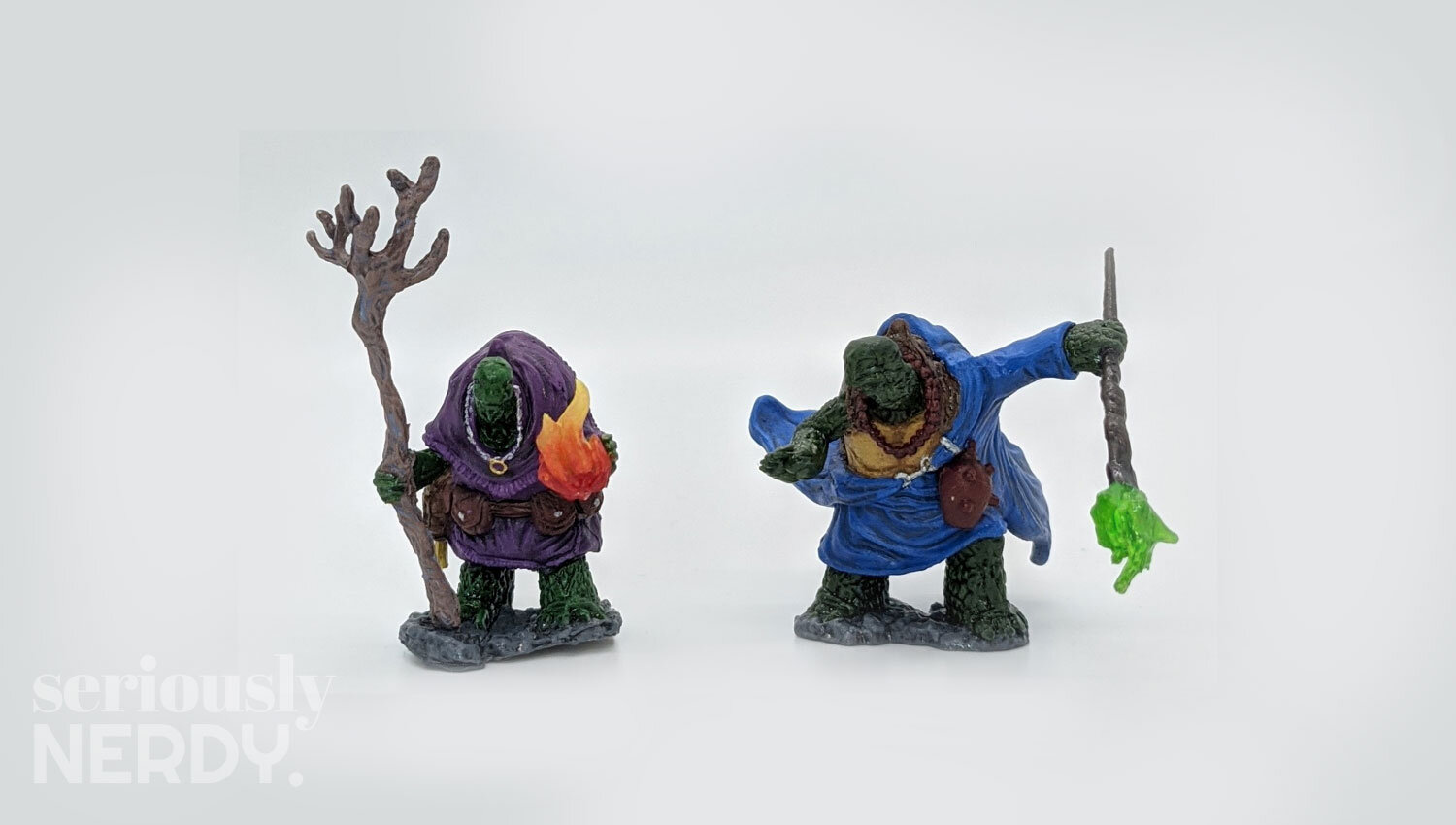
The D&D 5E campaign that I’m a part of has a whole northern region inhabited by tortles. In an effort to feel in tune with that, I bought the only tortles I could find online: Nolzur’s Tortle Adventurers. They were good practice for fabric, as they’re mostly cloak. For the color scheme, I loosely based them off of the ninja turtles, which was both vibrant and delightful. I also bought some fluorescent green, knowing that I wanted to try and make their magic look, well, magical. I did try and stretch by painting a bright blue into the cracks of Purple Boi’s staff, but it did not give the intended effect. I still like the color, but it would’ve been nice to get it to pop like a glowing magical staff. Many lessons still to learn.
Frightbag is one of my favorite pieces. The model is Gauntfield by Reaper Bones and he’s freaky-deeky. I was at a complete loss for what colors to use with my spooky Skellington scarecrow monster, even after looking at what other artists had done via a Google image search. It turns out the answer was inside me all along: I based his color scheme on Scary Terry, the cheap ripoff of Freddie Kreuger from the Lawnmower Dog episode of Rick and Morty. He turned out very spooky scary, and the pink faces with the yellow eyes and blue hair really pop.
These days, if I’m ever not sure what color scheme to follow, I mostly think of what pop culture character the figure reminds me of. It may not be entirely original, but this way I am always delighted.
Takeaways
I know I kind of vomited a lot of commentary here, but I promise there are takeaways:
Start small. I found that it really pays off to start small with units I’m not too emotionally attached to. Then I worked my way up with some 1-3 color objects before going for anything really ambitious, especially if they were more expensive units.
Print lines are lessons. 3D printed units have their pitfalls, but if you have a resin printer, there’s no reason why you can’t print and paint. I have an FDM printer, and I’m doing it anyway. I just have to accept the reality of print lines and know that small things will look smudgy.
Plan ahead. There’s real value to thinking strategically about the order in which you paint things. I think of it as working my way out, knowing what will be the most frustrating to reach.
Inspiration is everywhere. When I don’t know what color scheme I want, I basically rip off my favorite things or what makes me laugh. Either it’ll look like your inspiration and be delightful, or it won’t and you can keep that secret knowledge to delight you even more.
Gear up. If you get into miniature painting and want to get better photos of them, I recommend buying a cheap Light Box like this kit I found on Amazon. You can appreciate the details of your minis better if they’re lit well when you snap those sweet, sweet pics.


